iOS 26 is here. Every year we release major updates to our flagship apps alongside the new version of iOS, but not this year. Rather than stay silent and risk Silkposts, let’s share our thoughts and plans.
Deciding When It’s Time to Move On
In 2017 we launched the first version of our pro camera, Halide. In those days, the days of the iPhone 7, you just wanted manual control over focus, shutter speed, white balance… controls you expect in a classic camera.
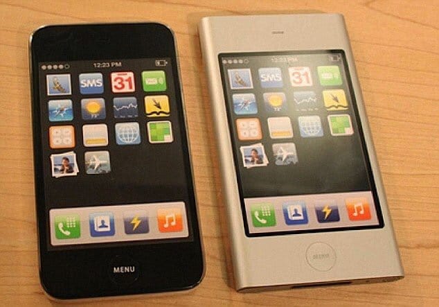
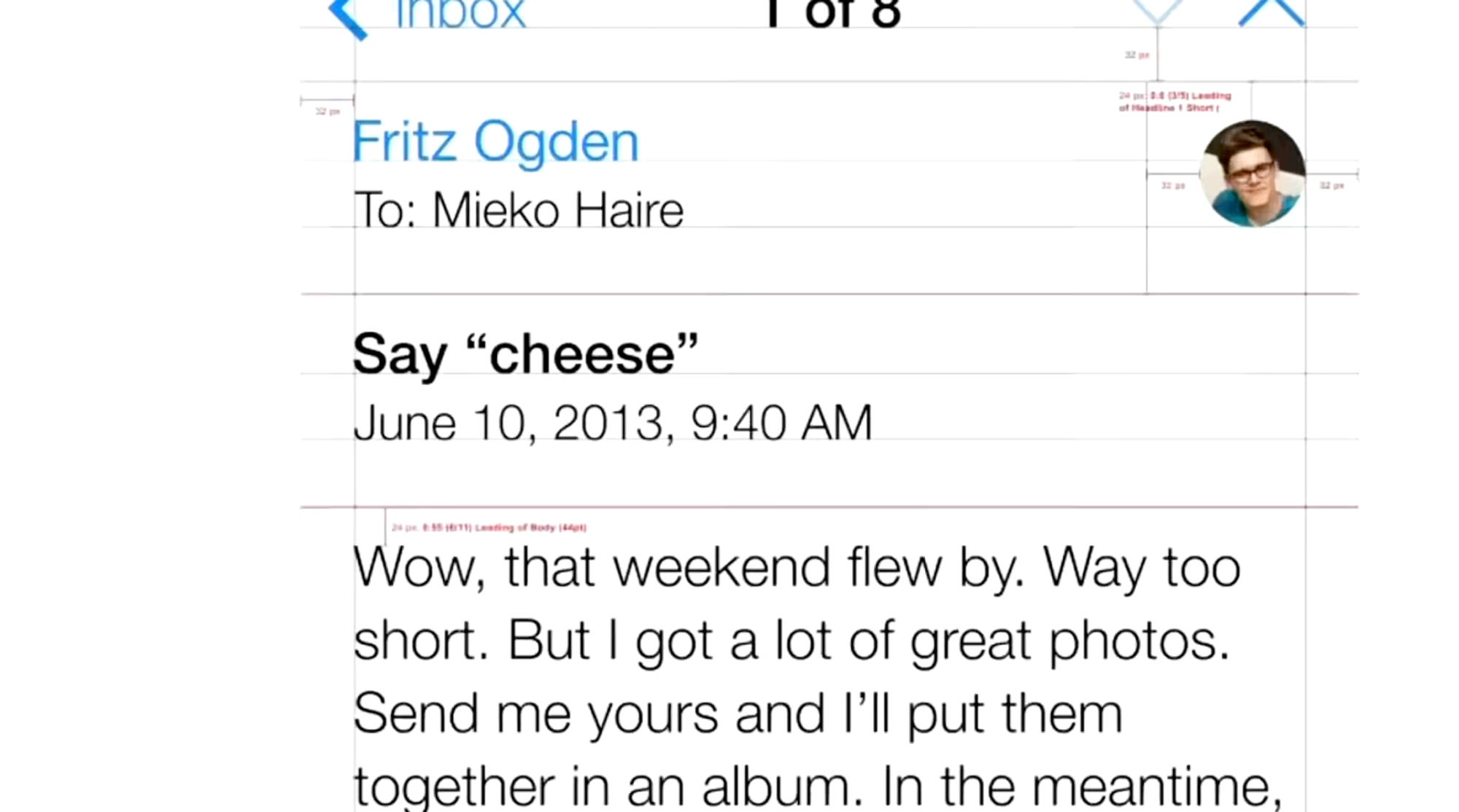
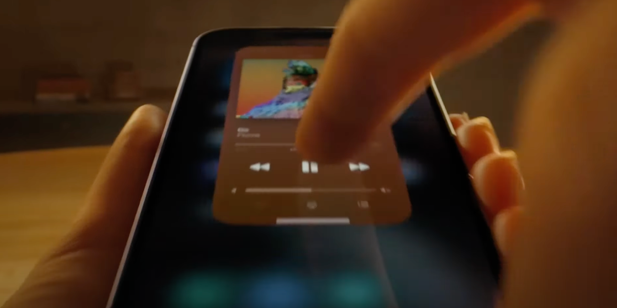
Today, algorithms matter as much as a camera’s lens. Halide kept up with changing times by offering control over these algorithms, and it became one of our most popular features, but we have to admit we aren’t happy with how things evolved, with too many controls tucked away in settings.
This is getting busy.
How did things get so complicated?
Our app grew organically from its 1.0, and while we still love its design, we believe it will hit a bit of an evolutionary dead-end. Almost 10 years later, cameras and the way we take photos have changed a lot. We have big plans, and if we’re going to be build the best camera for 2025 and beyond, we need to rethink things from the ground up.
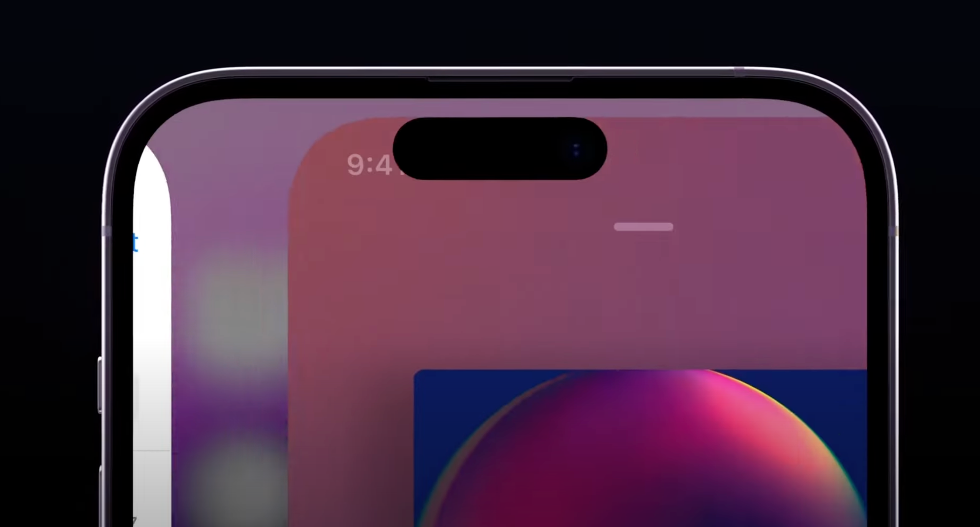
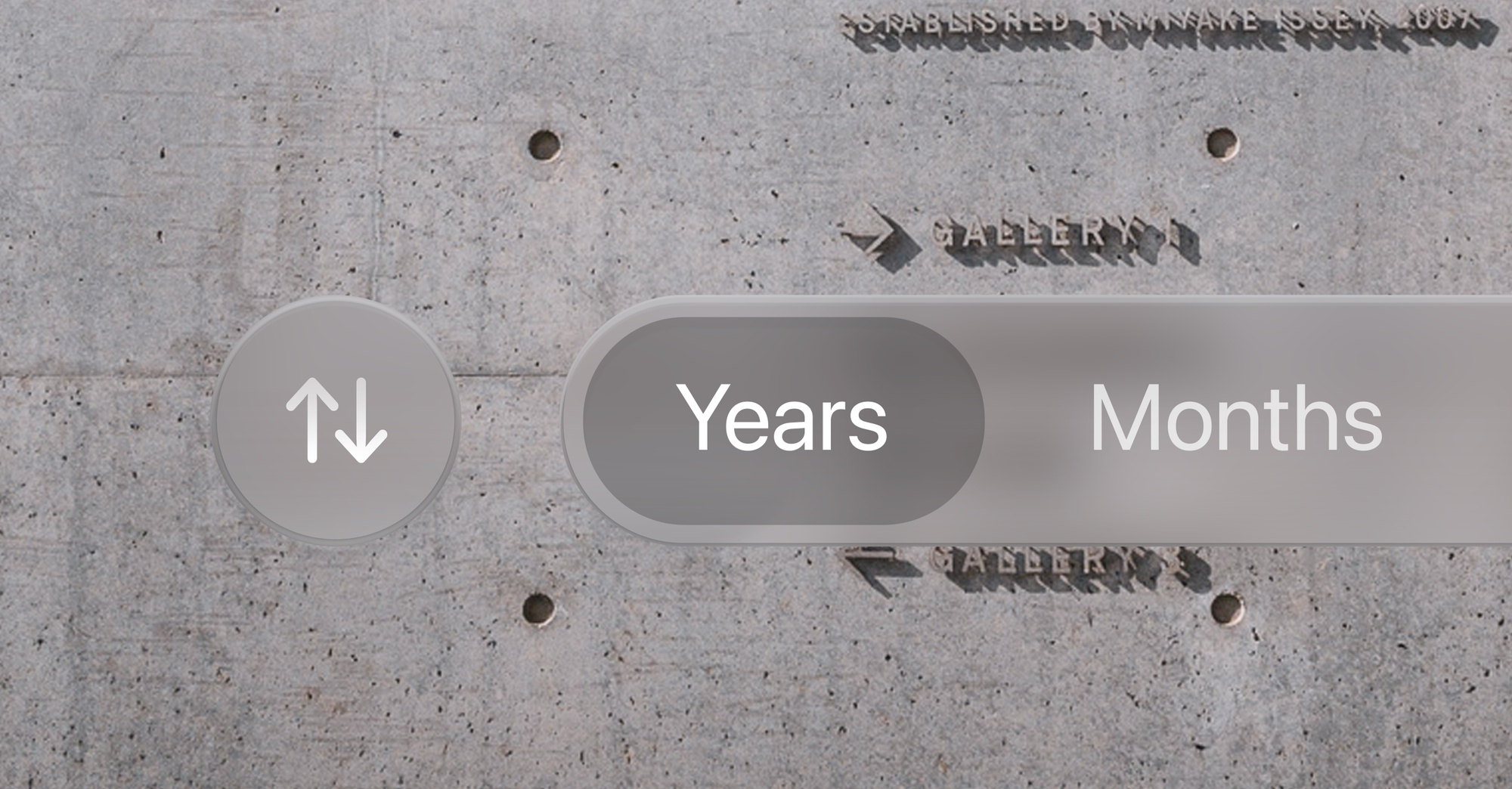
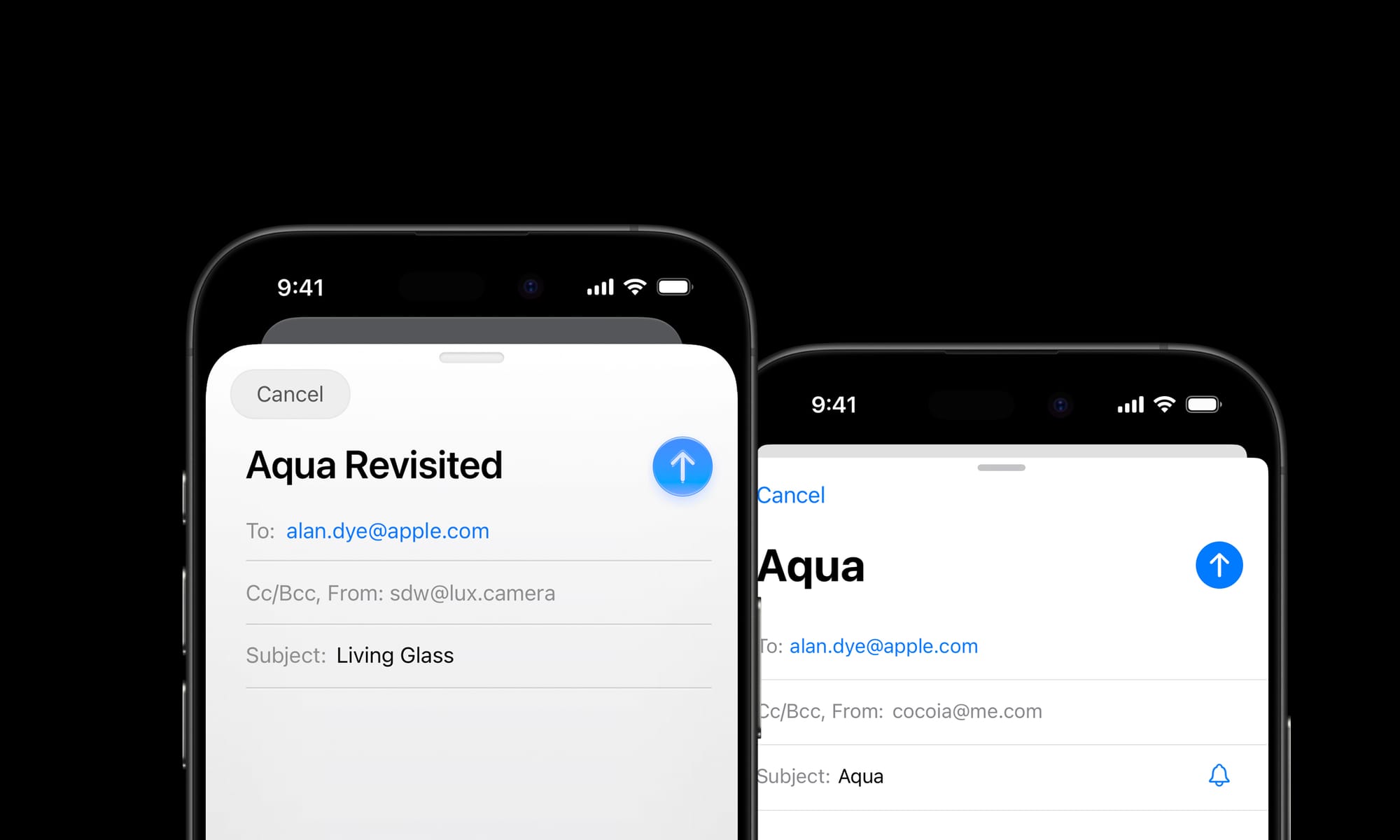
For example, rather than bury the controls from earlier in settings, what if we put them right next to the shutter?
A change like this may sound simple, but these changes have ripple effects across our entire interface and product. I’ll spare you a few thousand words and leave Sebastiaan to walk you through our big new design sometime soon.
If our visuals show cobwebs, let’s just say the code hosts a family of possums. Since 2017, Apple’s SDKs changed faster than we could keep up. Refreshing our codebase should improve speed, reliability, polish, and cut down the time it takes to ship new features.
It sure sounds like we should rewrite Halide.
If you’ve ever taken part in a rewrite, I know your first reaction is, “Oh no,” and as someone who lived through a few big rewrites, I get it. Big rewrites kill companies. It’s irresponsible to do this in the middle of iPhone season, the time we update our apps to support the latest and greatest cameras.
So we are not rewriting Halide right now.
We rewrote it two years ago.
In Summer 2023, we began our investigation into a modern codebase. We built a fun iPad monitor app, Orion, test the maturity Apple’s new frameworks and experiment on our own new architecture. We were delighted by the results, and so were you! We were surprised Orion only took 45 days.
This gave us the confidence to test our platform on a bigger, higher-stakes project: our long-awaited filmmaking app Kino. We began work in Fall 2023, shipped in under six months, and won 2024 iPhone App of the Year.
record scratch yep, that’s me. You’re probably wondering…
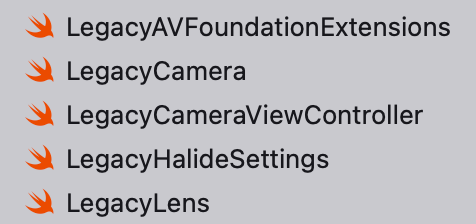
This signaled our new architecture was ready for prime time, so earlier this year, we drew a line in the sand. In our code, we renamed everything Halide 2.x and earlier, “Legacy Halide.” Mark III will be a clean break.
A few files in Xcode
After a few weeks of knocking out new features faster than ever, it was clear this was the right decision. Kino let us skip over the hard and uncertain part, and now all that’s left is speed-running the boring part of translating the old bits to the new system.
Through The Liquid Glass
In June, Apple unveiled the new design language of iOS 26, Liquid Glass, and it threw a monkey wrench in all of our plans. As someone who worked on a big app during the iOS 7 transition, I know platform rewrites are wrought with surprises all the way up to launch.
Before we decided how to proceed with our flagship apps, and its effects on Mark III, we need to investigate. So we returned to Orion, our low-stakes app with fewer moving parts. Updating Orion’s main screen for liquid glass took about a day, but it was not without snags, like when I spent an hour in the simulator fine tuning the glass treatment of our toolbar only to discovered it rendered differently on the actual device.
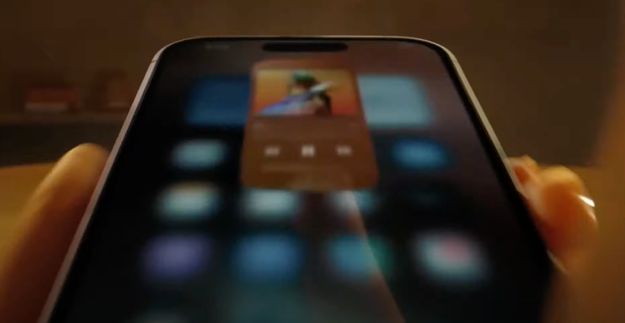
We moved on to Kino, which already aligned with the iOS 26 design system pretty well. Sebastiaan updated its icon treatment, which looks great when previewed in Apple’s tools.
The version previewed on Icon Composer
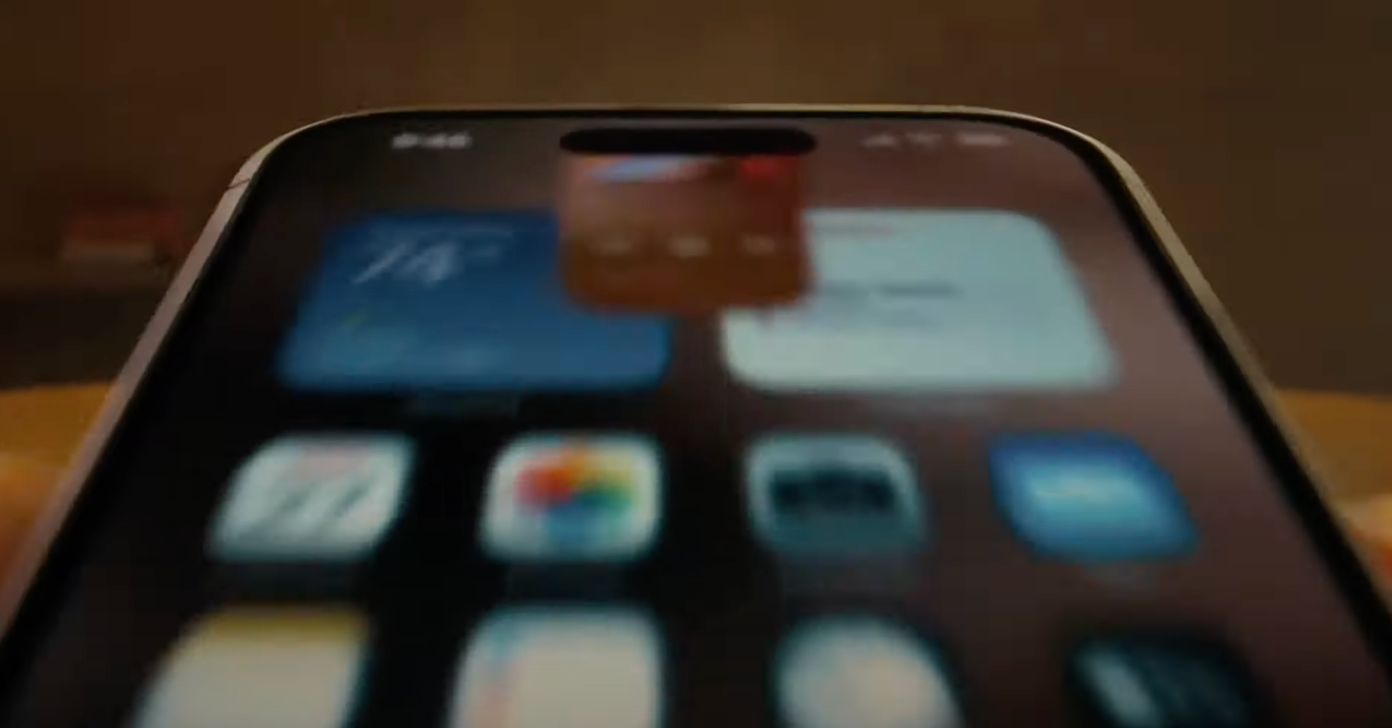
However, when we loaded it on the device…
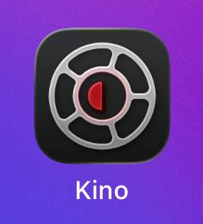
The version on a real device
This issue still persists in the final version of iOS 26, and filed a bug report with Apple (FB20283658). We’ll hold off on our Kino update until it’s sorted out.
None of these issues are insurmountable, but troubleshooting iOS bugs for Apple can be its own part-time job. As a team with only one developer, this left us with three options for Halide:
Option 1: Embrace Liquid Glass in Legacy Halide. Liquid Glass paradigms go beyond the special effects, such as its embrace of nested menus. Reducing the new design system to a stylistic change— a glorified Winampskin— is a recipe for disappointment. Unfortunately, a deep rethinking of legacy Halide would force us to halt Mark III development for months, just to update a codebase on its way out.
Option 2: Rush Mark III with Liquid Glass to make the iOS 26 launch. Even before Apple unveiled the Liquid Glass treatment, Mark III was arriving at similar concepts. We’re confident that the two design systems will fit well together. So what if we tackle both challenges at once, and target an immovable iOS 26 deadline? Nope. A late app is eventually good, but a rushed app is forever bad.
Option 3: Wait to launch a full Liquid Glass redesign alongside a rock solid Mark III. This is what we did, and we think it paid off big time. Earlier this week we released an early preview of our new UI (without any liquid glass) to Halide subscribers via our Discord. The results were overwhelming positive.
The Rollout (and early upgrade perks)
That’s not to say we have nothing to show for iOS 26. Today we’re launching Orion 1.1. It retains most of its retro aesthetics, but we’re also digging how the liquid glass treatment interacts with our custom CRT effect.
We’ve also added a long-requested feature: fit and fill, for aspect-fill ratios. You can finally play your virtual console games in full screen glory!
For Kino, we’re holding off on our update until we sort out the iOS bugs. Maybe things will be fixed in an iOS 26.1 update.
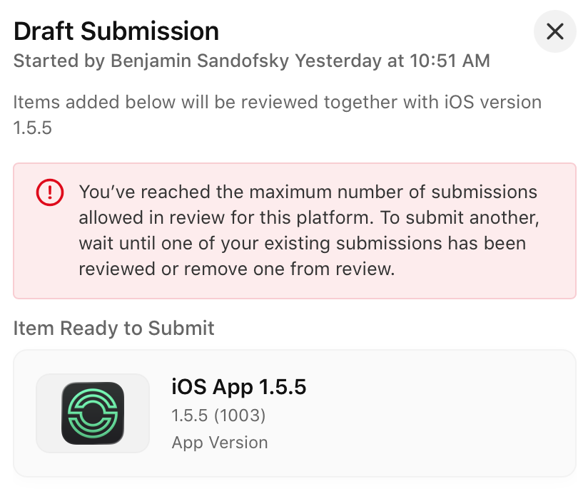
We have an update ready for our award winning long exposure app, Spectre. Unfortunately, it appears the App Store portal is broken at the moment, and won’t allow us to submit the update.
Luckily, we submitted an update to Halide before running into this issue. It updates the icon, fixes a few glitches, and includes basic stylistic updates. We just released this update, moments ago.
Earlier today, we received our new phones and we’ve begun running them through the paces. We’ll submit an update to support the new hardware and fix any bugs, assuming the App Store lets us.
These updates to Halide are a swan song for the legacy codebase. After this month, all of our energy goes Mark III, which includes the real Liquid Glass alongside a redesigned camera for a new age.
If you’d like a peek at things to come, we’ve opened another thousand spots in TestFlight to Halide subscribers. It’s got tons of bugs, and parts are incomplete, but will give you an idea of where things are headed. If you’d rather wait for a polished experience, or prefer a one-time-upgrade, no problem. As we announced last winter, everyone who bought Mark II eventually gets Mark III for free.
It feels bittersweet moving on. Hopping into Legacy Halide to crank out updates feels a bit like a slog, while the new Mark III design and codebase is a joy. It makes me wish I wish I’d gutted Halide years ago. At the same time, there are moments I feel warmth for a project where I spent almost a decade of my life. It helps you understand why nostalgia means, “A pain from an old wound.”
In Summary
We have an Orion update out, today
We have a Spectre update, soon
We might have a Kino update, soon?
We have a Halide update, today
Halide Subscribers can sign up for the Mark III TestFlight, today
We’ll have a wider Mark III preview, this Fall
If everything goes according to plan, we expect to launch Mark III, this Winter
This won’t be the last you’ll hear from us this Fall. Stay tuned for a post from Sebastiaan on our new design, along with our annual iPhone reviews.
It’s an exciting time to be a designer on iOS. My professional universe is trembling and rumbling with a deep sense of mystery. There’s a lot of rumors and whispers of a huge redesign coming to the iPhone’s operating system — one that is set to be ‘the biggest in a long time’.
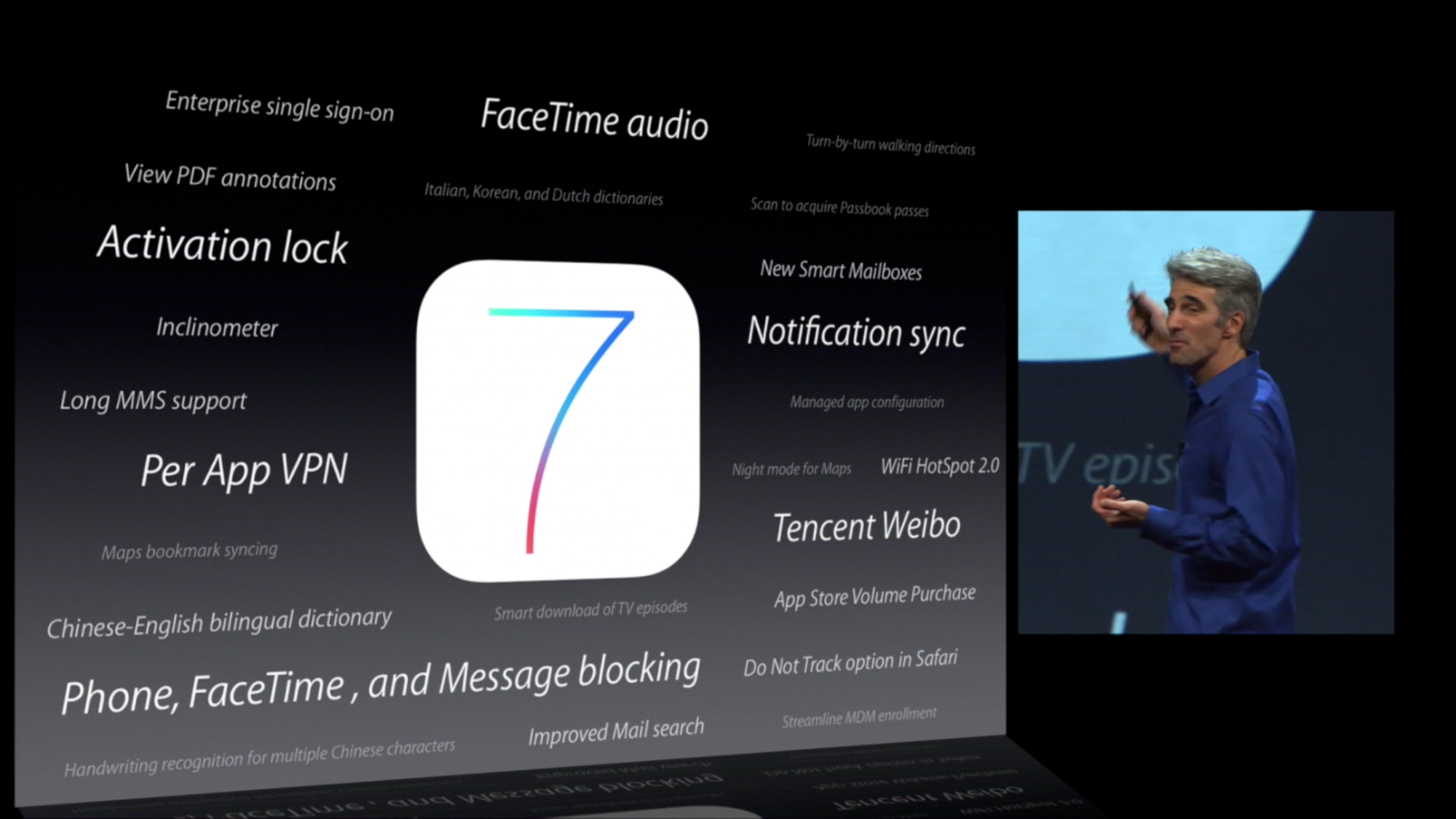
There’s only been one moment that was similar to this: the spring of 2013. On June 10th, Apple showed off what would be the greatest paradigm shift in user interface design ever: iOS 7. I remember exactly where I was and how I felt. It was a shock.
If there is indeed a big redesign happening this year, it’ll be consequential and impactful in many ways that will dwarf the iOS 7 overhaul for a multitude of reasons. The redesign is rumored to be comprehensive; a restyling of iOS, macOS, iPadOS, tvOS, watchOS and visionOS. In the intervening years between iOS 7’s announcement and today, iPhones have gone from simply a popular device to the single most important object in people’s lives. The design of iOS affected and inspired most things around, from the web to graphic design and any other computer interface.
That’s why I figured I’d take this moment of obscurity, this precious moment in time where its changes are still shrouded in fog to savor something: wholesale naivety of where things are going, so I can let my imagination run wild.
What would I do if I were Apple’s design team? What changes would I like to see, and what do I think is likely? Considering where technology is going, how do I think interface design should change to accommodate? Let’s take a look at what’s (or what could be) next.
Smart people study history to understand the future. If we were to categorize the epochs of iOS design, we could roughly separate them into the Shaded Age, the Adaptive Age, and the New Age.
The Shaded Age
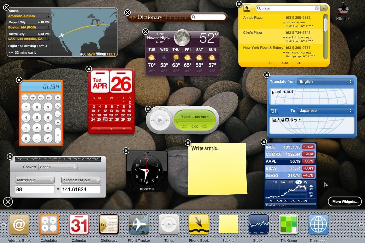
iOS started out as iPhone OS, an entirely new operating system that had very similar styling to the design language of the Mac OS X Tiger Dashboard feature:
The icon layout on iPhone OS 1 was a clear skeuomorph.
You might’ve heard that word being thrown around. It might surprise you that that doesn’t mean it has lots of visual effects like gradients, gloss and shadows. It actually means that to make it easier for users to transition from something they were used to — in this case, phones typically being slabs with a grid of buttons on them — to what things had become — phones were all-screen, so they could show any kind of button or interface imaginable.
At the time of iPhone 1’s launch, a cartoon of a ‘phone’ would still be drawn as the image on the left. A grid of buttons defined its interaction model and comfort zone.
And yes, there was a whole lot of visual effects in user interfaces from iPhone OS 1 to iOS 6. In this age, we saw everything from detailed gradients and shadows in simple interface elements to realistically rendered reel-to-reel tape decks and microphones for audio apps.
The Facebook share sheet had a paperclip on it! The texture of road signs on iOS maps was composed of hundreds of tiny hexagons!
Having actually worked on some of the more fun manifestations of it during my time working at Apple, I can tell you from experience that the work we did in this era was heavily grounded in creating familiarity through thoughtful, extensive visual effects. We spent a lot of time in Photoshop drawing realistically shaded buttons, virtual wood, leather and more materials.
That became known as ‘skeuomorphic design’, which I find a bit of a misnomer, but the general idea stands.
Of course, the metal of the microphone was not, in fact, metal — it didn’t reflect anything like metal objects do. It never behaved like the object it mimicked. It was just an effect; a purely visual lacquer to help users understand the Voice Memos app worked like a microphone. The entire interface worked like this to be as approachable as possible.
Notably, this philosophy extended even to the smallest elements of the UI: buttons were styled to visually resemble a button by being convex and raised or recessed; disabled items often had reduced treatments to make them look less interactive. All of this was made to work with lots of static bitmap images.
The first signs of something more dynamic did begin to show: on iPad, some metal sliders’ sheen could respond to the device orientation. Deleting a note or email did not simply make it vanish off-screen, but pulled it into a recycling bin icon that went as far as to open its lid and close it as the document got sucked in.
If it had not been for Benjamin Mayo publishing this video, no trace of this was ever even findable online.
Our brand new, rich, retina-density (2×) screens were about to see a radical transformation in the way apps and information were presented, however…
The Flat Age
iOS 7 introduced an entirely new design language for iOS. Much was written on it at the time, and as with any dramatic change the emotions in the community ran quite high. I’ll leave my own opinions out of it (mostly), but whichever way you feel about it, you can’t deny it was a fundamental rethinking of visual treatment of iOS.
iOS 7 largely did away with visual effects for suggesting interactivity. It went back to quite possibly the most primitive method of suggesting interactivity on a computer: some ‘buttons’ were nothing more than blue text on a white background.
The styling of this age is often referred to as ‘flat design’. You can see why it is called that: even the buttons in the calculator app visually indicate no level of protuberance:
The Home Screen, once a clear reference to the buttons on phones of yesteryear, was now much more flat-looking — one part owing to simpler visual treatment but also a distinct lack of usage of shadows.
But why did shadows have to go? They had an important function in defining depth in the interface, after all. Looking at the screenshot above actually does it no justice: the new iOS 7 home screen was anything but flat. The reason was that the shadows were static.
iOS 7 embraced a notion of distinct visual layers and using adaptive or dynamic effects to distinguish depth and separation. Why render flat highlights and shadows that are unresponsive to the actual environment of the user when you can separate the icons by rendering them on a separate plane from the background? Parallax made the icons ‘float’ distinctly above the wallpaper. The notification center sheet could simply be a frosted pane above the content which blurred its background for context.
Jony Ive proudly spoke at the iOS 7 introduction, on how ‘the simple act of setting a different wallpaper’ affected the appearance of many things. This was a very new thing.
Also a new thing in the interface was that the UI chrome was able to have the same dynamics: things like the header and keyboard could show some of the content they obscured shining through as if fashioned out of frosted glass.
While it was arguably an overcorrection in some places, iOS 7’s radical changes were here to stay — with some of its dynamic ‘effects’ getting greatly reduced (parallax is now barely noticeable). Over time, its UI regained a lot more static effects.
Type and icons grew thicker, shadows came back, and colors became a lot less neon.
One of the major changes over time was that iOS got rounder; in step with the hardware it came on, with newly curved screen corners and ever-rounder iPhones, the user interface matched it in lock-step. It even did this dynamically based on what device it was running on.
More interface elements started to blend with content through different types of blur like the new progressive blur, and button shapes were slowly starting to make a comeback. It settled into a stable state — but it was also somewhat stagnant. For bigger changes, there would have to be a rethink.
What would come next couldn’t simply be a static bitmap again: it would have to continue the trend of increasingly adaptive interfaces.
The Age of Physicality
When Apple’s designers imagined the interface of VisionOS, they had a mandate to essentially start from scratch. What does an ‘app’ look like in an augmented reality?
What appears to be a key foundational tenet of the VisionOS design language is how elements are always composed of ‘real’ materials. No flat panels of color and shapes exist as part of the interface.
This even applies to app icons: while they do have gradients of color, they occupy discrete layers of their own, with a clear intention from their introduction video of feeling like actual ‘materials’:
Alan Dye, upon introduction of the VisionOS interface, stated that every element was crafted to have a sense of physicality: they have dimension, respond dynamically to light, and cast shadows.
This is essential in Vision Pro because the interface of apps should feel like it can naturally occupy the world around you and have as much richness and texture as any of the objects that inhabit that space. Comparing to the interfaces we are familiar with, that paradigm shift is profound, and it makes older, non physicality-infused interfaces feel archaic.
If I were to position a regular interface in the Vision Pro context, the result looks almost comically bad:
I find it likely, then, that there will be more than a mere static visual style from visionOS brought to iPhone, iPad and Mac (and potential new platforms) — it seems likely that a set of new fundamental principles will underpin all of Apple’s styling across products and expressions of its brand.
It would have to be more subtle than on Vision Pro – after all, interfaces do not have to fit in with the ‘real world’ quite as much – but dynamic effects and behavior essentially make the interface come to life.
Sound familiar? Existing aspects of the iPhone user interface already do this:
0:00
/0:17
Apple’s new additions to the iOS interface of the last years stand out as being materially different compared the rest of the interface.
They are completely dynamic: inhabiting characteristics that are akin to actual materials and objects. We’ve come back, in a sense, to skeuomorphic interfaces — but this time not with a lacquer resembling a material. Instead, the interface is clear, graphic and behaves like things we know from the real world, or might exist in the world. This is what the new skeuomorphism is. It, too, is physicality.
The Dynamic Island is a stark, graphic interface that behaves like an interactive, viscous liquid:
You can see it exhibiting qualities unique to its liquid material, like surface tension, as parts of it come into contact and meld together.
When it gains speed, it has momentum, much like the scrolling lists of the very first iteration of iPhoneOS, but now it reads more realistic to us as it also has directional motion blur or a plane of focus as items move on their plane:
Similarly, the new Siri animation behaves a bit more like a physically embodied glow – like a fiery gas or mist that is attracted to the edges of the device and is emitted by the user’s button press or voice.
What could be the next step?
My take on the New Age: Living Glass
I’d like to imagine what could come next. Both by rendering some UI design of my own, and by thinking out what the philosophy of the New Age could be.
A logical next step could be extending physicality to the entirety of the interface. We do not have to go overboard in such treatments, but we can now have the interface inhabit a sense of tactile realism.
Philosophically, if I was Apple, I’d describe this as finally having an interface that matches the beautiful material properties of its devices. All the surfaces of your devices have glass screens. This brings an interface of a matching material, giving the user a feeling of the glass itself coming alive.
Buttons and other UI elements themselves can get a system-handled treatment much like visionOS handles window treatments.*
*VisionOS is an exceptionally interesting platform, visual effect-wise, as the operating system gets very little data from the device cameras to ensure privacy and security. I would imagine that the “R1” chip, which handles passthrough and camera feeds, composes the glass-like visual effects on the UI chrome. All Apple devices can do this: they already do system-level effect composition for things like background blurs.
I took some time to design and theorize what this would look like, and how it would work. For the New Design Language, it makes sense that just like on VisionOS, the material of interactivity is glass:
My mockup of a dynamic glass effect on UI controls
Glass is affected by its environment. The environment being your content, its UI context, and more.
Since it is reflective, it can reflect what is around it; very bright highlights in content like photos and videos can even be rendered as HDR highlights on Glass elements:
Note the exhaust flare being reflected in the video playback bar; an interactive element like the close button in the top left has its highlights dynamically adjusted by the scene, too.
Glass elements visibly occupy a place in a distinct spatial hierarchy; if it does not, elements can be ‘inlaid’: in essence, part of the plane of glass that is your display or a glass layer of the UI:
Much like the rear of your iPhone being a frosted pane of glass with a glossy Apple logo, controls or elements can get a different material treatment or color. Perhaps that treatment is even reactive to other elements in the interface emitting light or the device orientation — with the light on it slightly shifting, the way the elements do on VisionOS when looked at.
Controls may transition as they begin to overlay content. One can imagine animated states for button lifting and emerging from their backdrop as it transitions the hierarchy:
These effects can be rendered subtly and dynamically by the system. In comparison, it makes ‘regular’ static interfaces look and feel inert and devoid of life.
Glass has distinct qualities that are wonderful in separating it from content. It can blur the material below it, as we already see in modern iOS controls. It can have distinct, dynamic specular highlights from its surroundings:
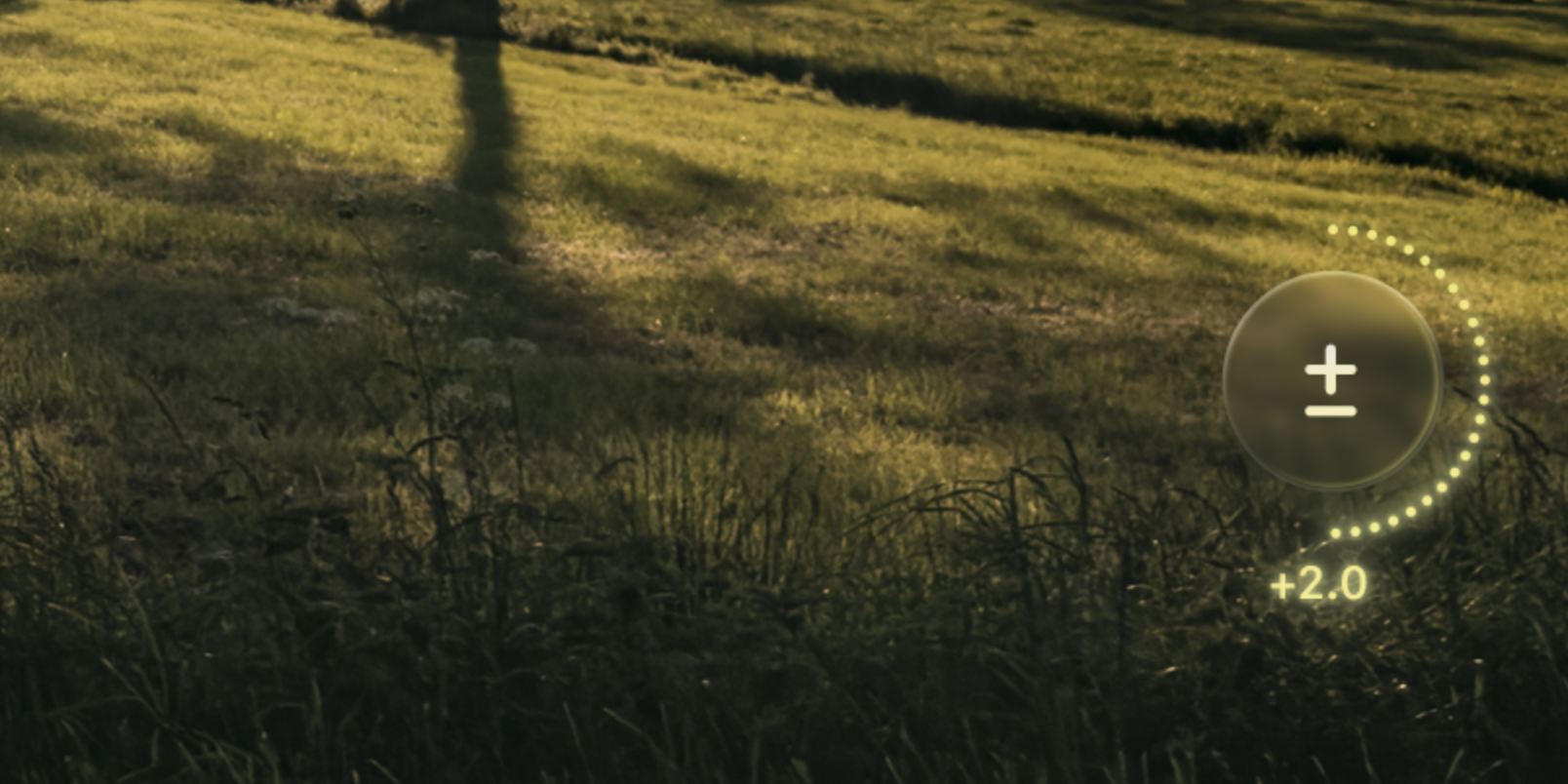
A little drag control for exposure, as a spin on our modern EV adjustment in Halide. Note the material itself responding to the light the adjustment emits.
It can have caustics, which is to say it separates itself from the backdrop by showing interaction with light in its environment by casting light, not shadow:
… and it can also get infused with the color and theme of the interface around it. Glass does not just blur or refract its background: it reflects, too. This isn’t totally out of left field: this is seen in the WWDC25 graphics, as well:
Elements of Style
Having a set of treatments established, let’s look at the elements of the New iOS Design.
Tab Bar
I would imagine that the era of ‘closed tab bars’, that is, the type that masks the content outright is ending. In fact, I wouldn’t be surprised if almost all UI that outright masks the interface like that as a max-width bar would be gone.
These types of static interface panels are a legacy element from the early days of iOS. The new type can float over content:
Controls like this are better suited to transition to rise from its underlying ‘pane’ as you scroll it out of view, and can similarly also hide themselves so they’re not obscuring content all the time.
Controls
It can be overwhelming for all elements in the interface to have a particularly rich treatment, so as I mentioned before, I would expect there to be various levels of this ‘depth’ applied. Core actions like the email sending button in Mail can be elevated:
Whereas other actions that are part of the same surface — like the ‘Cancel’ action here — can get more subtle treatments.
Elevated controls can be biased slightly towards warmer color balance and background elements towards cool to emphasize depth.
App Icons
Apple put considerable work into automatic masking for icons in iOS 18, and I doubt it was only for Dark Mode or tinted icons on an identical black gradient icon backdrop. The simple, dark treatment of icon backgrounds makes me imagine it was preparation for a more dynamic material backdrop.
Dynamic icon backdrops in Dark Mode – note the variable specular highlights based on their environment.
Not to mention, app icons are exactly the type of interactive, raised element I spoke of before that would be suited to a living glass treatment.
Dynamic rendering of icons with a ‘content layer’, glassy effects and an overall polishing of existing designs. The corners are also slightly rounder.
I’d also imagine some app icons that are due for a redesign would get updates. Many haven’t been updated since iOS 7. This would be a major change to some of Apple’s ‘core brands’, so I expect it to be significant, but consistent with the outgoing icons to maintain continuity while embracing the new visual language —kind of like the Safari icon above.
On the note of icons, I also wouldn’t be surprised if the system icons themselves got a little rounder.
Home Screen
It seems likely the Home Screen as a whole is re-thought for the first time. Its complexity has ballooned since the early days of iOS. I find myself spending a lot of time searching in my App Library.
I think there’s a great AI-first, contextual slide-over screen that can co-exist with the regular grid of apps we are used to. I was a bit too short on time to mock this up.
Sliders and Platters
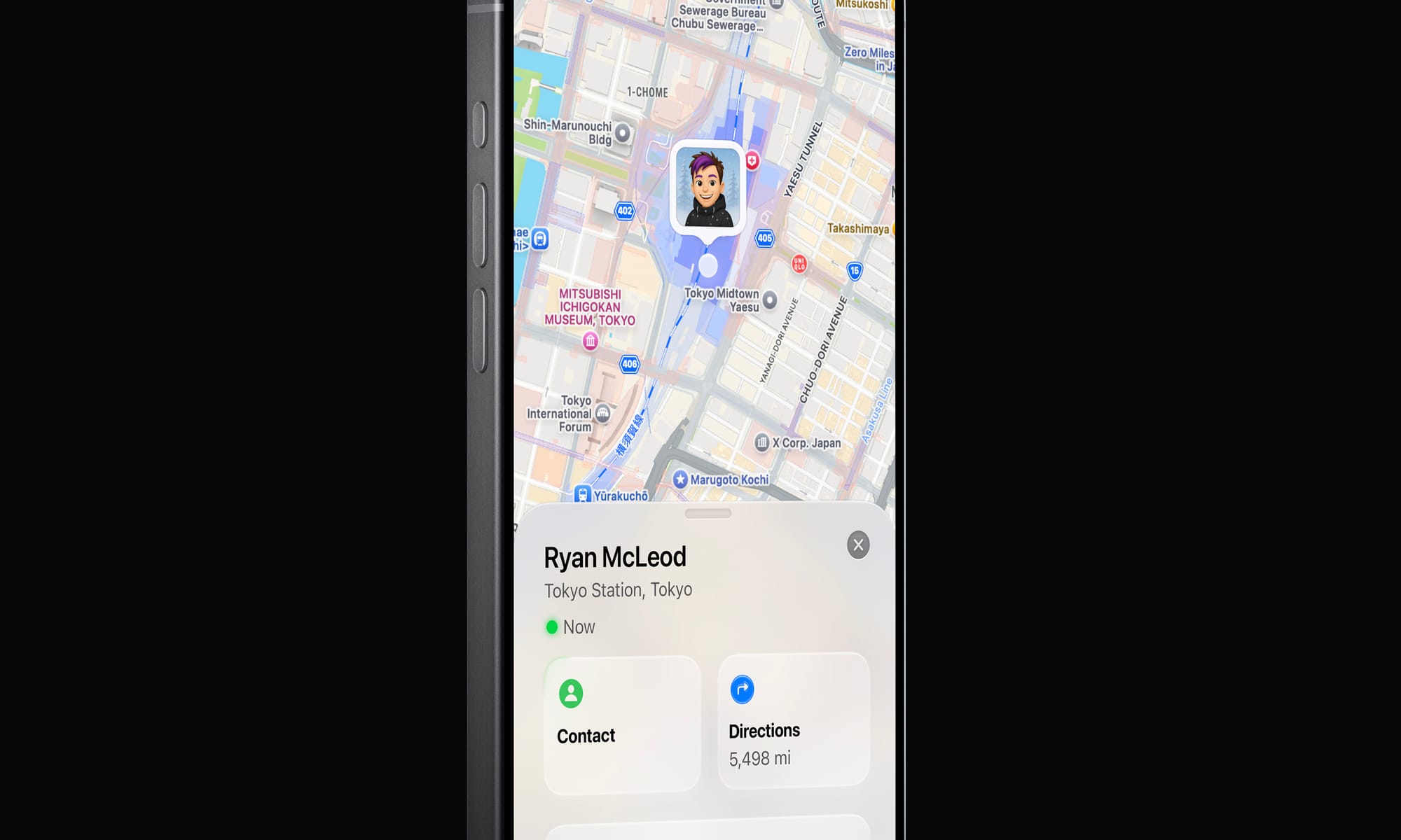
Basic interactive building blocks of the iOS interface will get system-provided treatments that are responsive to their environment:
Note how the Contact platter has some environment interaction with the green ‘Now’ light
Overall, one can imagine a rounding and softening of the interface through translucent materials looking pretty great.
Beyond
This ‘simple’ change in treatment — to a dynamic, glassy look — has far-reaching consequences.
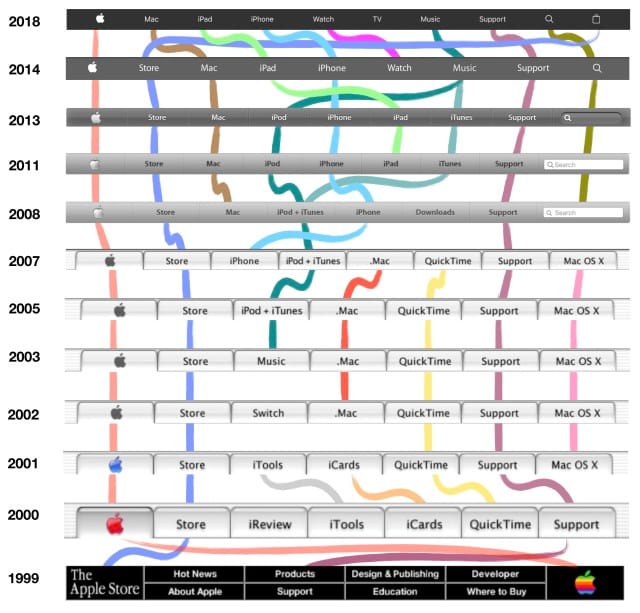
Apple is unique — its predominant user interface style in the 2000s has always been linked to its branding. Its icons are also logos, its treatments a motif that stretch far beyond platforms they live on. Consider the navigation of Apple.com:
The navigation of Apple’s website has changed in step with major UI design eras. The introduction and maturation of Aqua in 2000 and beyond; iPhone and Mac OS X’s softer gradients in 2008; and finally, a flatter look after 2014.
It is not a stretch to assume that this, too, would assume some kind of dynamic, new style. Therein lie some of the challenges.
I love products with innovative, novel interfaces — modern iOS isn’t a simply a product, but a platform. Its designers bear responsibility to make the system look good even in uncontrolled situations where third party developers like myself come up with new, unforeseen ideas. That leaves us with the question of how we can embrace a new, more complex design paradigm for interfaces.
A great thing that could come from this is new design tools for an era of designing interfaces that go so far beyond placing series of rounded rectangles and applying highly limited effects.
When I spoke of designing fun, odd interfaces in the ‘old days’, this was mostly done in Photoshop. Not because it was made for UI design — quite the contrary. It just allowed enough creative freedom to design anything from a collection of simple buttons to a green felt craps table.
Green felt, rich mahogany, shiny gold and linen in the span of about 450 pixels.
If what is announced is similar to what I just theorized, it’s the beginning of a big shift. As interfaces evolve with our more ambient sense of computing and are infused with more dynamic elements, they can finally feel grounded in the world we are familiar with. Opaque, inert and obstructive elements might occupy the same place as full-screen command line interfaces — a powerful niche UI that was a marker in history, passed on by the windowed environment of the multi-tasking, graphical user interface revolution.
Science Fiction and Glass Fiction
The interfaces of computers of the future are often surprisingly easy to imagine. We often think of them and feature them in fiction ahead of their existence: our iPhone resembles a modern Star Trek tricorder; many modern AI applications resemble the devices in sci-fi movies like ‘Her’ and (depressingly) Blade Runner 2049. It’s not surprising, then, that concept interfaces from the likes of Microsoft often feature ‘glass fiction’:
The actual interface is unfortunately not nearly as inspired with such life and behavioral qualities. The reason is simple: not only is the cool living glass of the video way over the top in some places, but few companies can actually dedicate significant effort towards creating a hardware-to-software integrated rendering pipeline to enable such UI innovations.
Regardless, we like to imagine our interfaces being infused with this much life and joy. The world around us is — but our software interfaces have remained essentially lifeless.
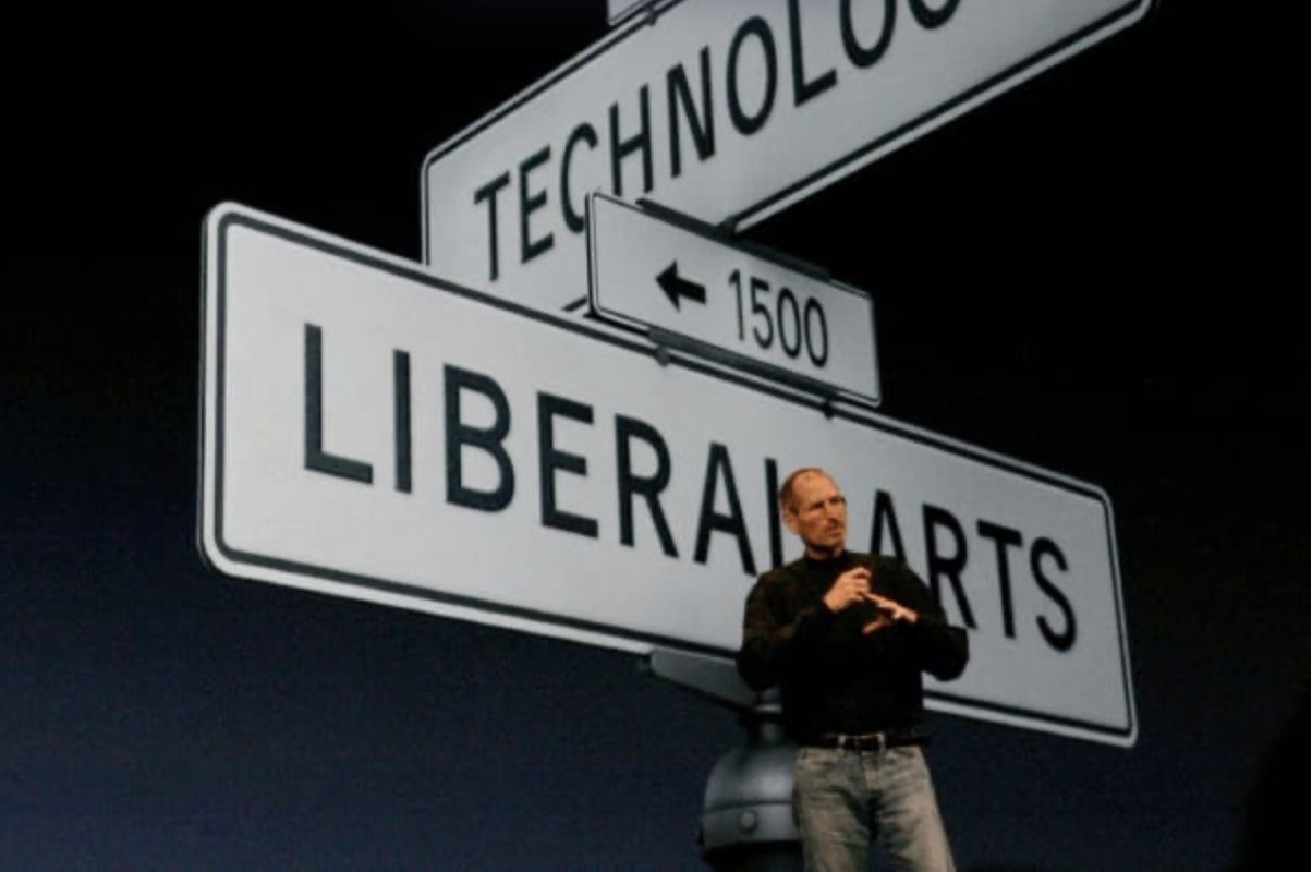
And that brings us to Apple. There was an occasion or two where Apple announced something particularly special, and they took a beat on stage to pause and explain that only Apple could do something like this. It is a special marriage of hardware, and software — of design, and engineering. Of technology and the liberal arts.
And that still happens today. Only Apple could integrate sub pixel antialiasing and never-interrupted animations on a hardware level to enable the Dynamic Island and gestural multi-tasking; only Apple can integrate two operating systems on two chips on Vision Pro so they can composite the dynamic materials of the VisionOS UI. And, perhaps only Apple can push the state of the art to a new interface that brings the glass of your screen to life.
We’ll see at WWDC. But myself, I am hoping for the kind of well-thought out and inspired design and engineering that only Apple can deliver.
All writing, conceptual UI design and iconography in this post was made by hand by me. No artificial intelligence was used in authoring any of it.
Last year we announced HDR or “High Dynamic Range” photography was coming to our popular photography app, Halide. While most customers celebrated, some were confused, and others showed downright concern. That’s because HDR can mean two different, but related, things.
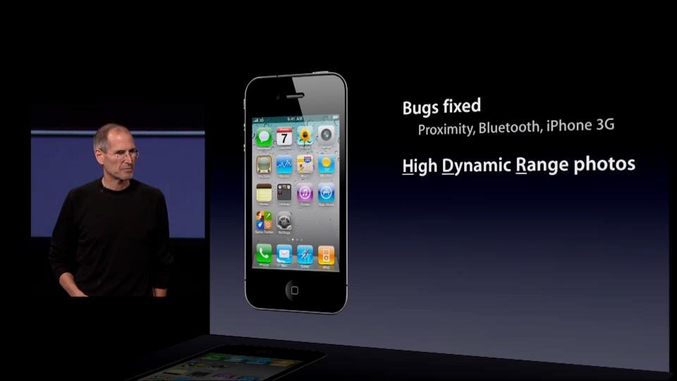
The first HDR is the “HDR mode” introduced to the iPhone camera in 2010.
September, 2010
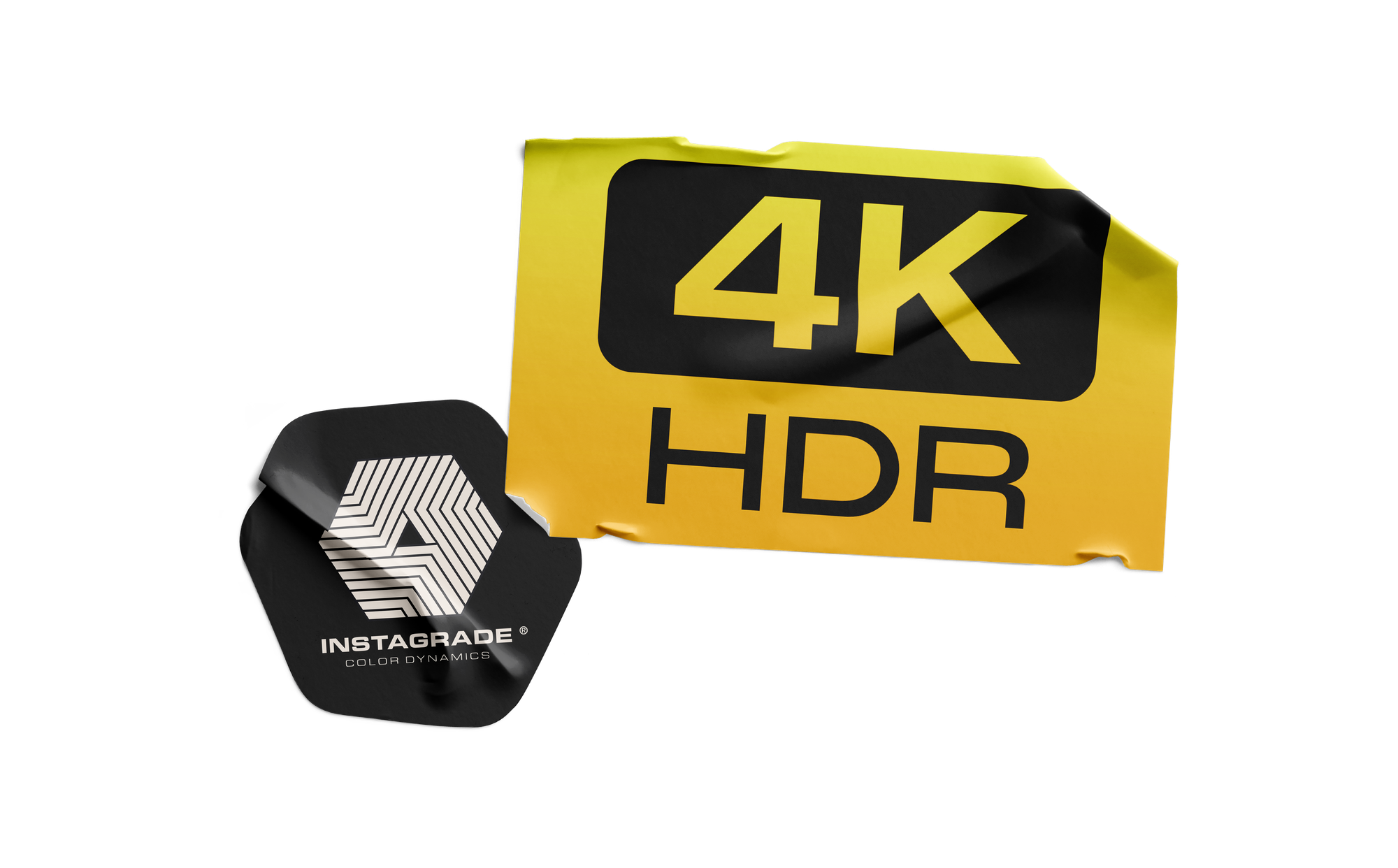
The second HDR involves new screens that display more vibrant, detailed images. Shopped for a TV recently? No doubt you’ve seen stickers like this:
This post finally explains what HDR actually means, the problems it presents, and three ways to solve them.
What is Dynamic Range?
Let’s start with a real world problem. Before smart phones, it was impossible to capture great sunsets with point-and-shoot cameras. No matter how you fiddled with the dials, everything came out too bright or too dark.
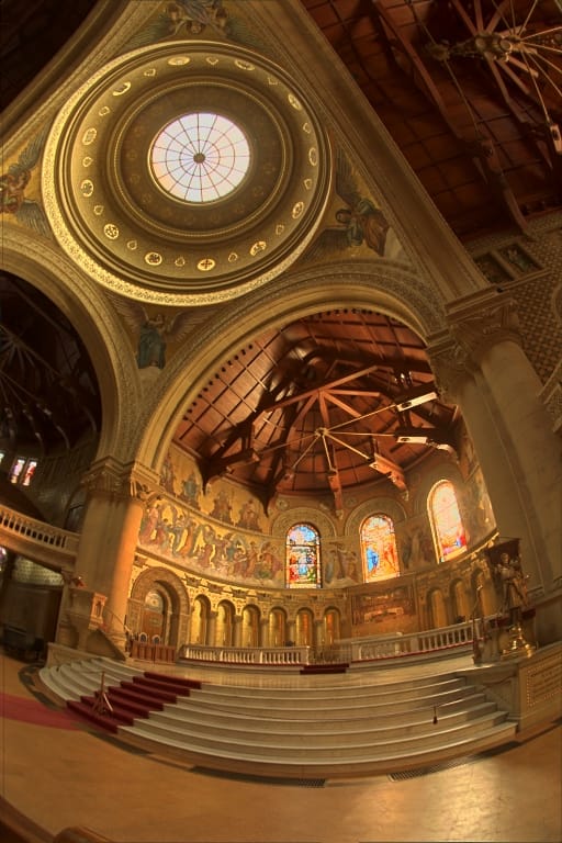
The result of trying to capture a sunset with an old-school camera.
In that photo, the problem has to do with the different light levels coming from the sky and the buildings in shadow, the former emitting thousands of times more light than the latter. Our eyes can see both just fine. Cameras? They can deal with overall bright lighting, or overall dim lighting, but they struggled with scenes contain both really dark and really bright spots.
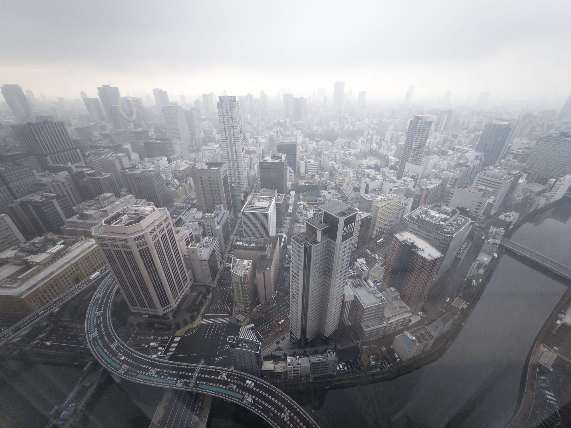
Dynamic range simply means, “the difference between the darkest and brightest bits of a scene.” For example, this foggy morning is an example of a low dynamic range scene, because everything is sort of gray.
Screens have no trouble showing this low-contrast photo. Shot with Halide in Osaka.
Most of our photos aren’t as extreme as bright sunsets or foggy mornings. We’ll just call those “standard dynamic range” or SDR scenes.
Before we move on, we need to highlight that the HDR problem isn’t limited to cameras. Even if you had a perfect camera that could match human vision, most screens cannot produce enough contrast to match the real world.
Regardless of your bottleneck, when a scene contains more dynamic range than your camera can capture or your screen can pump out, you lose highlights, shadows, or both.
Solution 1: “HDR Mode”
In the 1990s researchers came up with algorithms to tackle the dynamic range problem. The algorithms started by taking a bunch of photos with different settings to capture more highlights and shadows:
This full sequence has 16 photos. Via Paul Debevec.
Then the algorithms combined everything into a single “photo” that matches human vision… a photo that was useless, since computer screens couldn’t display HDR. So these researchers also came up with algorithms to squeeze HDR values onto an SDR screen, which they called “Tone Mapping.”
The Reinhard Tone Mapper, invented in 2002. It is one of many.
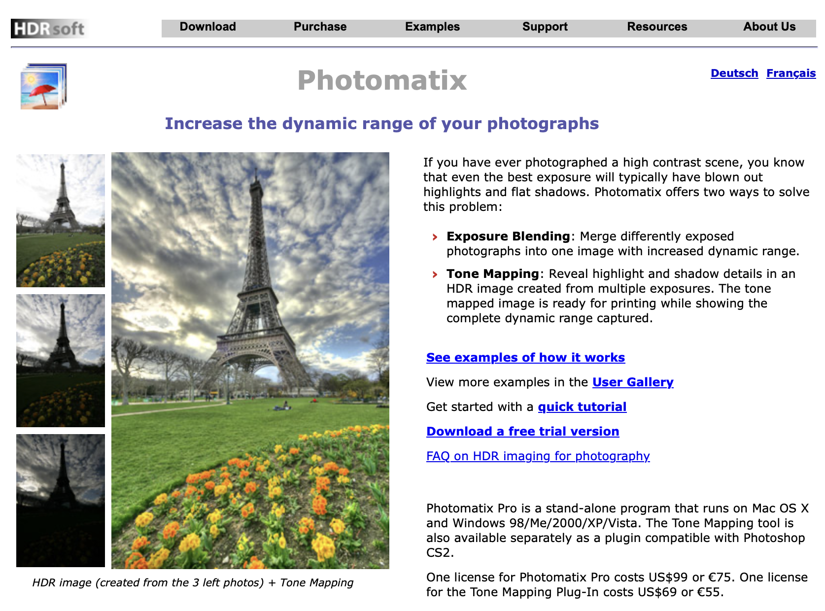
These algorithms soon found their way into commercial software for camera nerds.
Photomatix Circa 2008
Unfortunately, these packages required a lot of fiddling, and too many photographers in the mid-2000s… lacked restraint.
Taste aside, average people don’t like fiddling with sliders. Most people want to tap a button and get a photo that looks closer to what they see without thinking about it. So Google and Apple went an extra step in their camera apps.
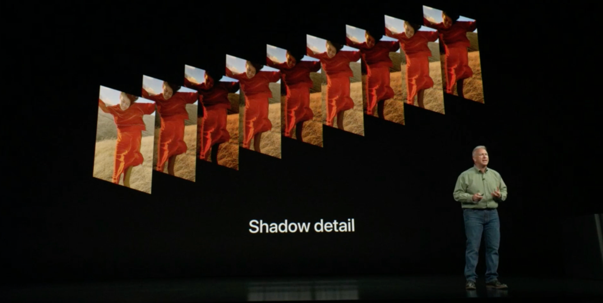
Your modern phone’s camera first captures a series of photos at various brightness levels, like we showed a moment ago. From this burst of photos, the app calculates an HDR image, but unlike that commercial software from earlier, it uses complex logic and AI to make the tone mapping choices for you.
Phil Schiller at the iPhone XS introduction showing off a newer Smart HDR
Apple and Google called this stuff “HDR” because “HDR Construction Followed By Automatic Tone Mapping” doesn’t exactly roll off the tongue. But just to be clear, the HDR added to the iPhone in 2010 was not HDR. The final JPEG was an SDR image that tries to replicate what you saw with your eyes. Maybe they should have called it “Fake HDR Mode.”
I know quibbling over names feels as pedantic as going, “Well actually, ‘Frankenstein’ was the doctor, you’re thinking of ‘Frankenstein’s Monster,’” but if you’re going to say you hate HDR, remember that it’s badtone mapping that is the actual monster. That brings us to…
The First HDR Backlash
Over the years, Apple touted better and better algorithms in their camera, like Smart HDR and Deep Fusion. As this happened, we worried that our flagship photography app, Halide, would become irrelevant. Who needs a manual controls when AI can do a better job?
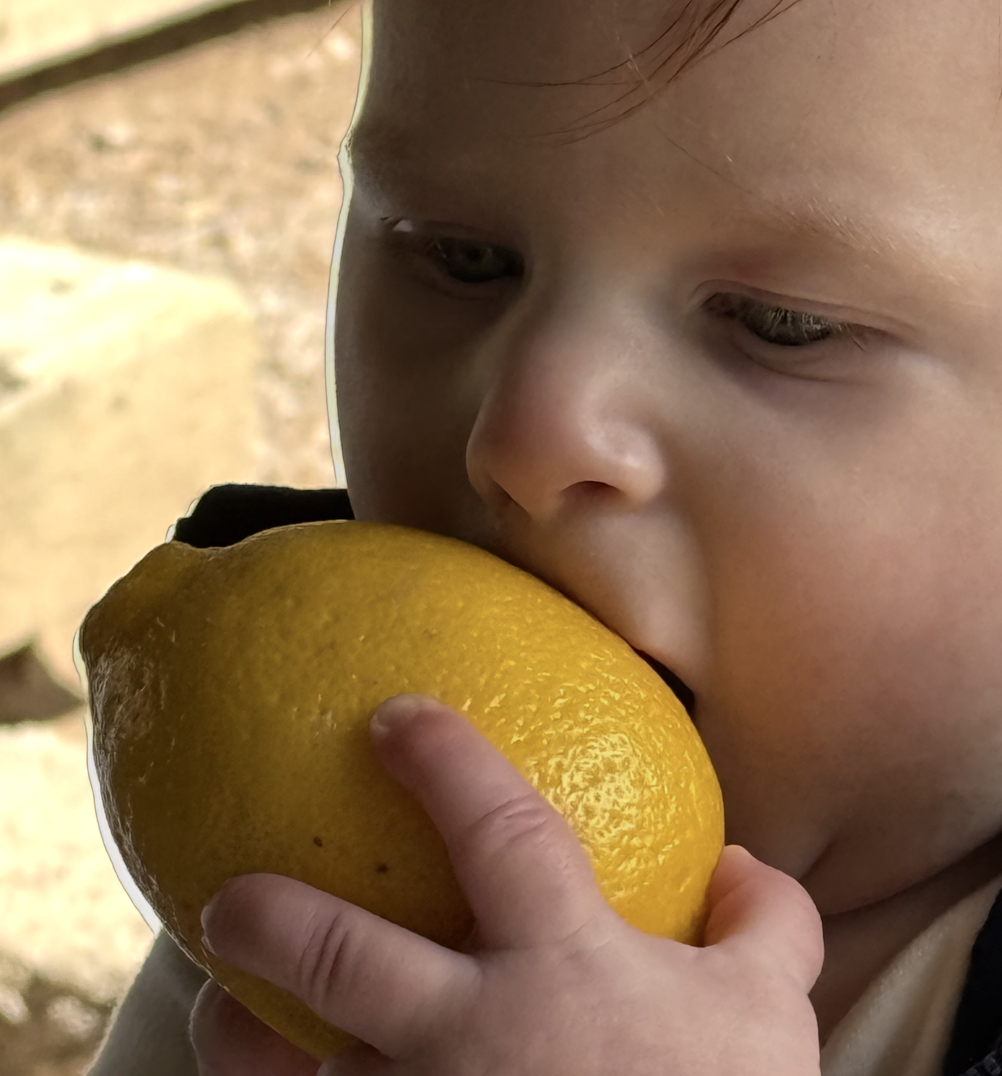
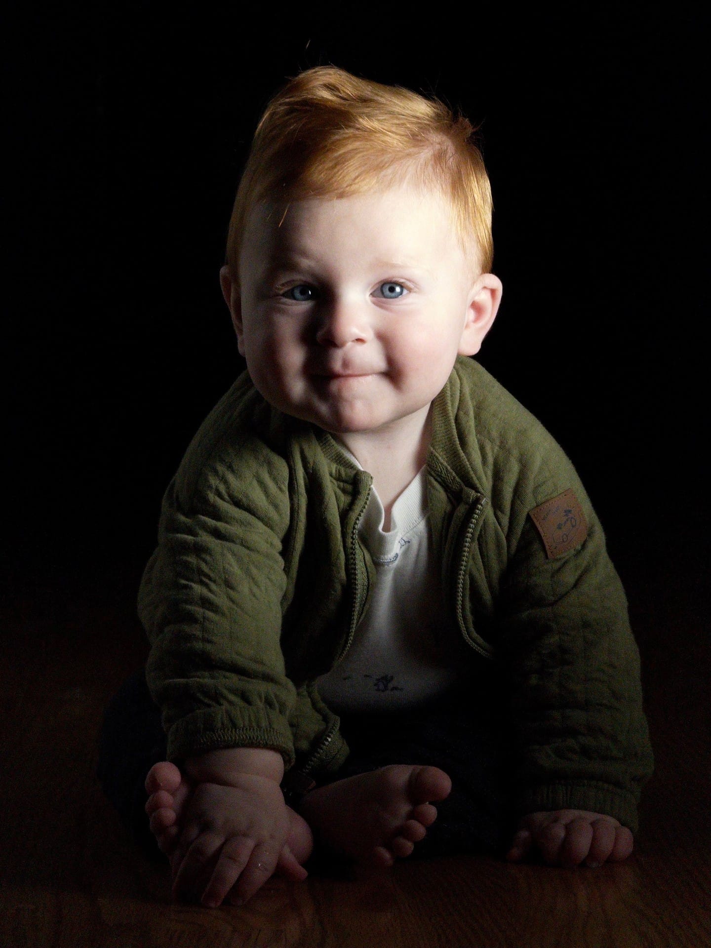
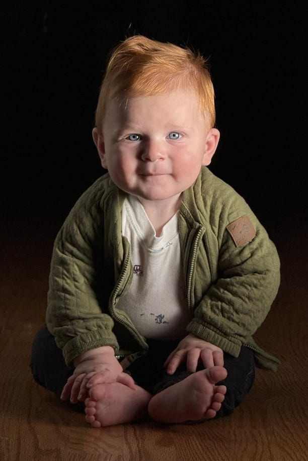
We were surprised to watch the opposite play out. As phone cameras got smarter, users asked us to turn off these features. One issue was how the algorithms make mistakes, like this weird edge along my son Ethan’s face.
When life gives you lemons, you… eat them.
That’s because Smart HDR and Deep Fusion require that the iPhone camera capture a burst of photos and stitch them together to preserve the best parts. Sometimes it goofs. Even when the algorithms behave, they come with tradeoffs.
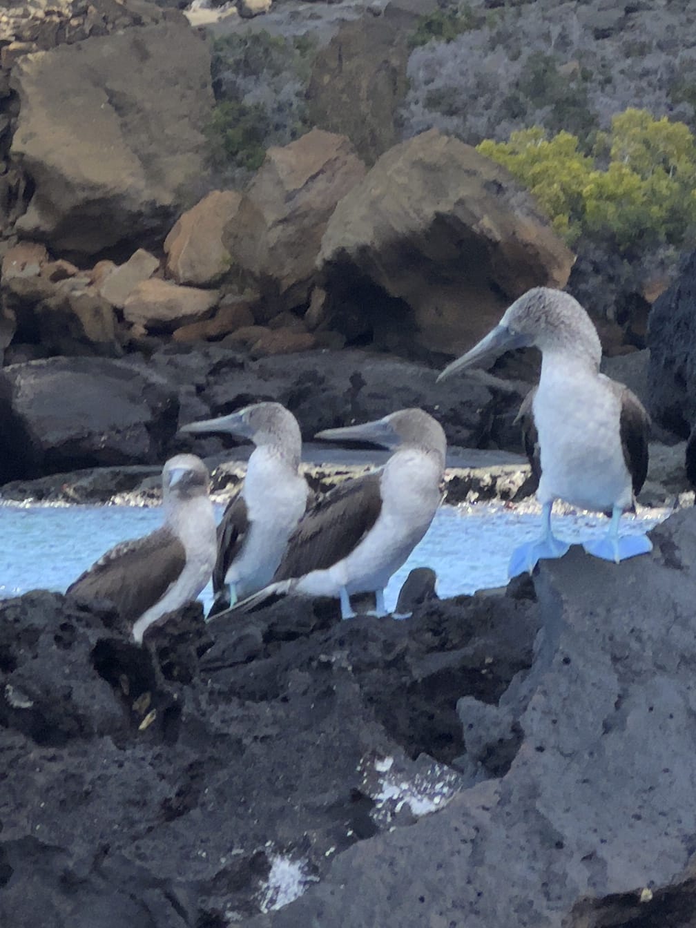
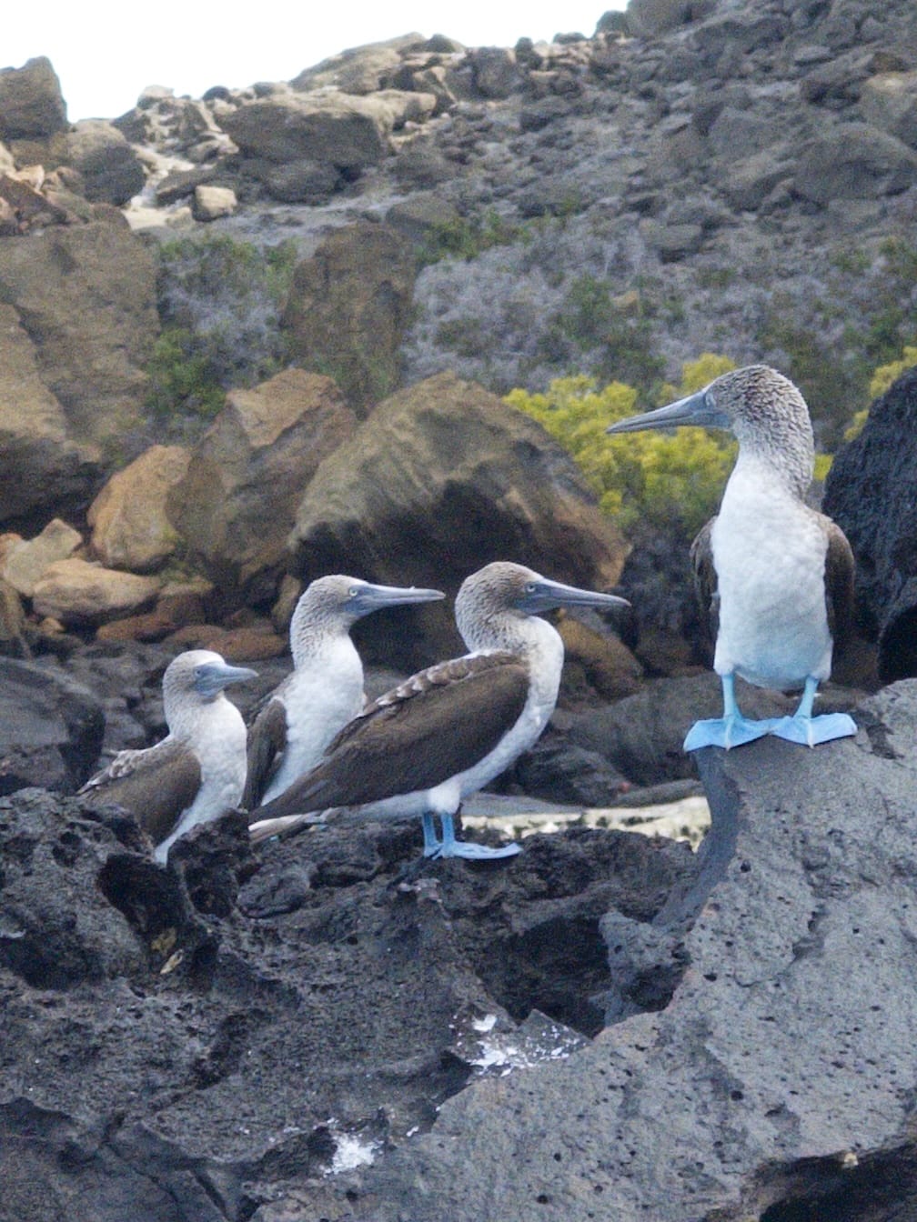
Consider these photos I took from a boat in the Galapagos: the ProRAW version, which uses multi-photo algorithms, looks smudgier than the single-shot capture I took moments later.
Left: Merged from Multiple Photos. Right: A single exposure.
What’s likely happening? When things move in the middle of a burst capture— which always happens when shooting handheld— these algorithms have to nudge pixels around to make things line up. This sacrifices detail.
Since 2020, we’ve offered users the option of disabling Smart HDR and Deep Fusion, and it quickly became one of our most popular features.
This lead us to Process Zero, our completely AI-free camera mode, which we launched last year and became a smashhit. However, without any algorithms, HDR scene end up over and under exposed. Some people actually prefer the look — more on that later — but many were bummed. They just accepted this as a tradeoff for the natural aesthetic of AI-free photos.
But what if we don’t need that tradeoff? What if I told you that analog photographers captured HDR as far back as 1857?
It’s even more incredible that this was done on paper, which has even less dynamic range than computer screens!
From studying these analog methods, we’ve arrived at a single-shot process for handling HDR.
Halide’s new, optional tone-mapping.
How do we accomplish this from a single capture? Let’s step back in time.
Learning From Analog
In the age of film negatives, photography was a three step process.
Capture a scene on film
Develop the film in a lab
Transfer the film to paper
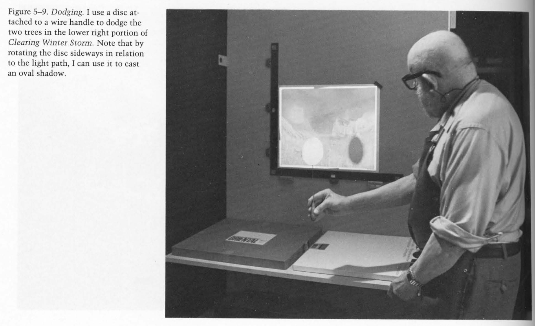
It’s important to break down these steps because— plot twist— film is actually a high dynamic range medium. You just lose the dynamic range when you transfer your photo from a negative to paper. So in the age before Photoshop, master photographers would “dodge and burn” photos to preserve details during the transfer.
An excerpt from The Print, the Ansel Adams Photography Series 3“Clearing Winter Storm, Yosemite National Park” Via Wikipedia.
Is it a lie to dodge and burn a photo? According to Ansel Adams in The Print:
When you are making a fine print you are creating, as well as re-creating. The final image you achieve will, to quote Alfred Stieglitz, reveal what you saw and felt.
I’m inclined to agree. I don’t think people reject processing your photos, whether it’s dodging-and-burning a print, or fiddling with multi-exposure algorithms. The problem is that algorithms are not artists.
AI cannot read your mind, so it cannot honor your intent. For example, in this shot, I wanted stark contrast between light and dark. AI thought it was doing me a favor by pulling out detail in the shadow, flattening the whole image in the process. Thanks Clippy.
Same lighting, moments apart. Left: Process Zero. Right: the iPhone camera’s automatic tone mapping.
Even when tone mapping can help a photo, AI may take things too far, creating hyper-realistic images that exist in an uncanny valley. Machines cannot reason their way to your vision, or even good taste.
We think there’s room for a different approach.
A Different Approach: Opt-In, Single Shot Tone Mapping
After considerable research, experimentation, trial and error, we’ve arrived on a tone mapper that feels true to the dodging and burning of analog photography. What makes it unique? For starters, it’s derived from a single capture, as opposed to the multi-exposure approaches that sacrifice detail. While a single capture can’t reach the dynamic range of human vision, good sensors have dynamic range approaching film.
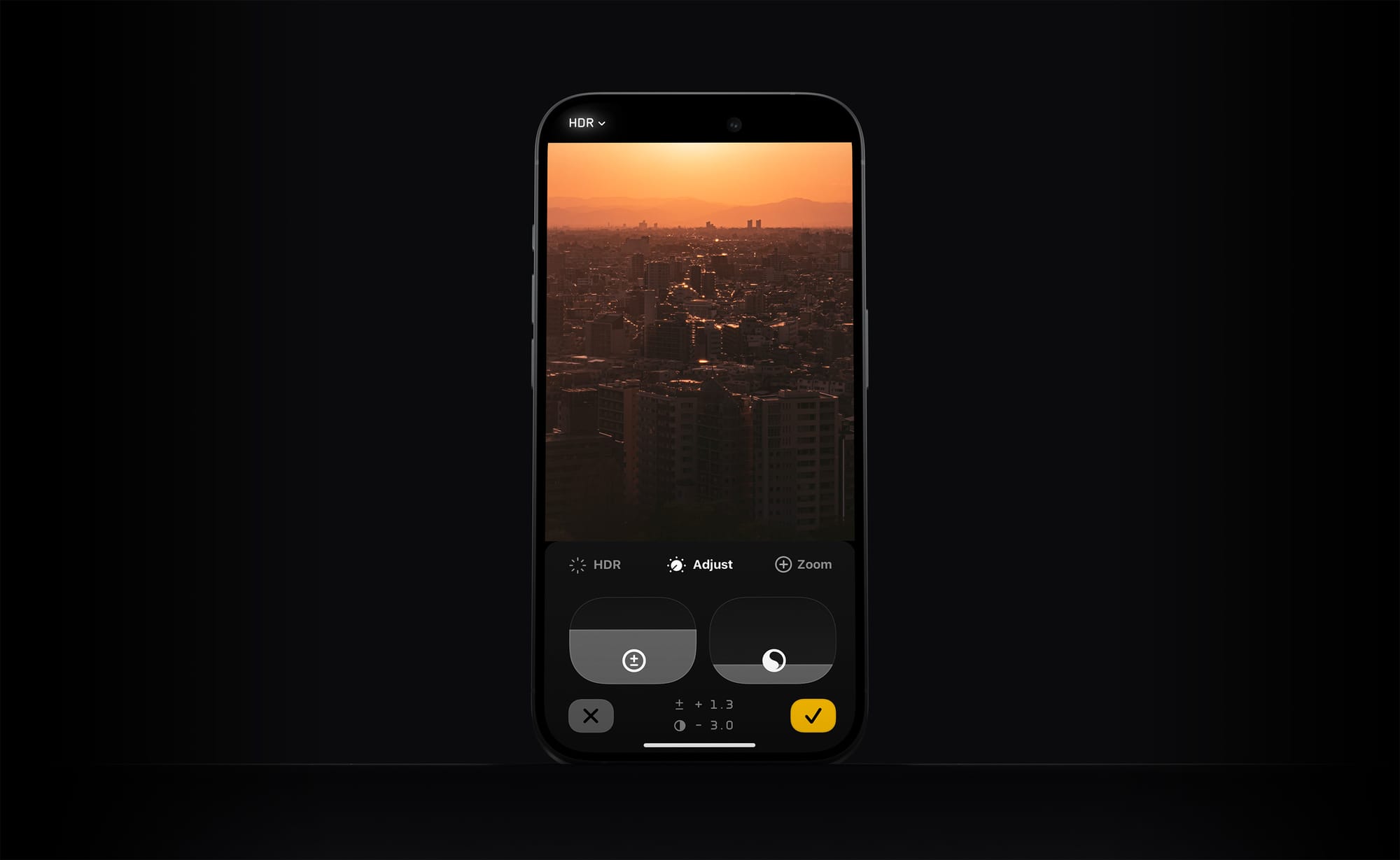
However, the best feature is that this tone mapping is off by default. If you come across a photo that feels like it could use a little highlight or shadow recovery, you can now hop into Halide’s updated Image Lab.
0:00
/0:08
In the Image Lab we have an exposure slider for adjusting overall brightness just like before. But to its right, we have a single dial that tames or boosts dynamic range. We think it’s up to the photographer to decide what feels right.
To be clear, the tone mapper works different than simply bringing your photo into an editor and dragging the “shadows” and “highlights” sliders. It also does it best to preserve local contrast.
Left and Middle: a shot with simple exposure adjustments. Right: a tone-mapped version.
Don’t worry: adjusting this stuff after-the-fact won’t sacrifice quality. Since Halide captures DNG or “digital negative” files, it contains all of the information that your screen cannot display. The shadow and highlight details are already in there, and the tone-mapping simply brings it out selectively.
Solution 2: Genuine HDR Displays
I went to all that trouble explaining the difference between HDR and Tone Mapping because… drum roll please… today’s screens areHIGHer DYNAMICRANGE!
0:00
/0:10
0:00
/0:10
0:00
/0:10
The atrium of the Hyatt Centric in Cambridge
Ok, today’s best screens still can’t match the high dynamic range of real life, but they’re way higher than the past. Spend a few minutes watching Apple TV’s mesmerizing screensavers in HDR, and you get why this feels as big as the move from analog TV to HDTV. So… nine years after the introduction of HDR screens, why hasn’t the world moved on?
A big problem is that it costs the TV, Film, and Photography industries billions of dollars (and a bajillion hours of work) to upgrade their infrastructure. For context, it took well over a decade for HDTV to reach critical mass.
Another issue is taste. Much like adding a spice to your meal, you don’t want HDR to overpower everything. The garishness of bad HDR has left many filmmakers lukewarm on the technology. Just recently, cinematographer Steve Yedlin published a two hour lecture on the pitfalls of HDR in the real world.
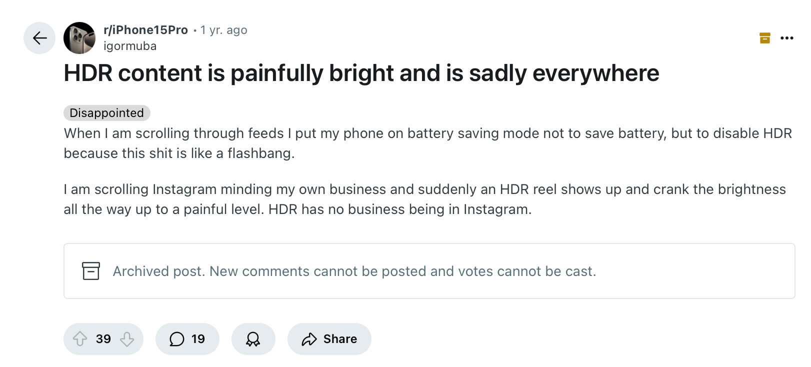
If you want to see how bad HDR displays can get, look no further than online content creators. At some point these thirsty influencers realized that if you make your videos uncomfortably bright, people will pause while swiping through their Instagram reels. The abuse of brightness has lead to people disabling HDR altogether.
For all these reasons, I think HDR could end up another dead-end technology of the 2010s, alongside 3D televisions. However, Apple turned out to be HDR’s best salesperson, as iPhones have captured and rendered HDR photos for years.
In fact, after we launched Process Zero last year, quite a few users asked us why their photos aren’t as bright as the ones produced by Apple’s camera. The answer was compatibility, which Apple improved with iOS 18. So HDR is coming to Process Zero!
To handle the taste problem, we’re offering three levels of HDR:
Standard: increases detail in shadows, and bumps up highlights while giving a tasteful rolloff in highlights
Max: HDR that pushes the limits of the iPhone display
Off: turns HDR off altogether.
Compatibility Considerations
Once you’ve got an amazing HDR photo, you’re probably wondering where you can view it, today. The good news is that every iPhone that has shipped for the last several years supports HDR. It just isn’t always available.
As we mentioned earlier, some users turn off HDR because the content hurts their eyes, but even if it’s on, it isn’t always on. Because HDR consumes more power, iOS turns it off in low-power mode. It also turns it off when using your phone in bright sunlight, so it can pump up SDR as bright as it can go.
An even bigger issue is where you can share it online. Unfortunately, most web browser can’t handle HDR photos. Even if you encode HDR into a JPEG, the browser might butcher the image, either reducing the contrast and making everything look flat, or clipping highlights, which is about as ugly as bad digital camera photos from the 1990s.
But wait… how did I display these HDR examples? If you look carefully those are short HDR videos that I’ve set to loop. You might need these kinds of silly hacks to get around browser limitations.
Until recently, the best way to view HDR was with Instagram’s native iPhone app. While Instagram is our users’ most popular place to share photos… it’s Instagram. Fortunately, things are changing.
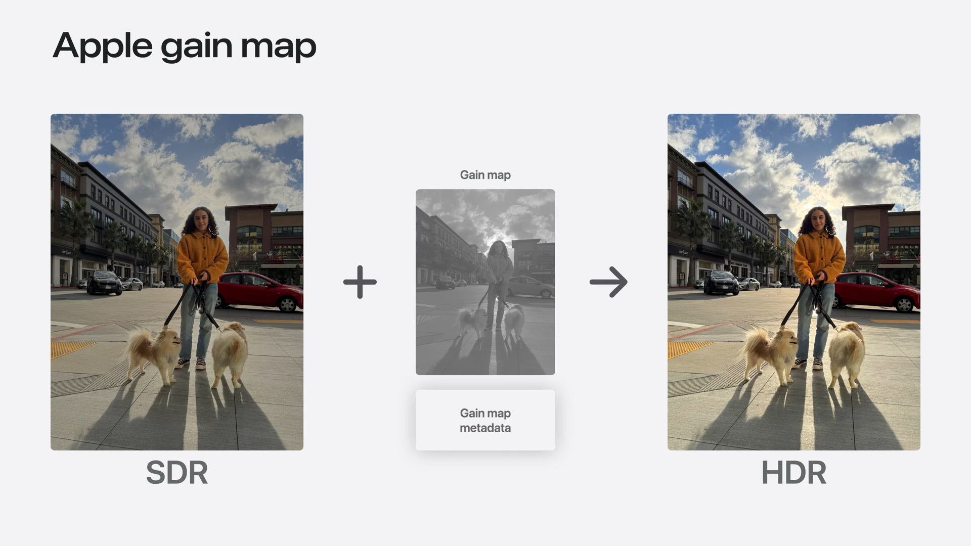
iOS 18 adopted Adobe’s approach to HDR, which Apple calls “Adaptive HDR.” In this system, your photos contain both SDR and HDR information in a single file. If an app doesn’t know what to do with the HDR information, or it can’t render HDR, there’s an SDR fallback. This stuff even works with JPEGs!
Browser support is halfway there. Google beat Apple to the punch with their own version of Adaptive HDR they call Ultra HDR, which Android 14 now supports. Safari has added HDR support into its developer preview, then it disabled it, due to bugs within iOS.
Speaking of iOS bugs, there’s a reason we aren’t launching the Halide HDR update with today’s post: HDR photos sometimes render wrong in Apple’s own Photos app! Oddly enough, they render just fine in Instagram and other third-party apps. We’ve filed a bug report with Apple, but due to how Apple releases software, we doubt we’ll see a fix until iOS 19.
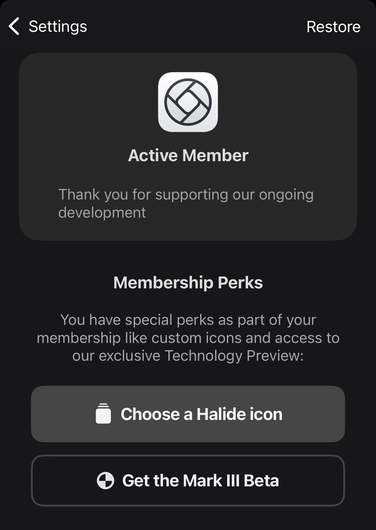
Rather than inundate customer support with angry emails about how photos don’t look right in Apple’s photos app, we’ve decided to release HDR support in our Technology Preview beta that we’re offering to 1,000 Halide subscribers. Why limit it to 1,000? Apple restricts how many people can sign up for TestFlight, so we want to make sure we stay within our limits. This is the start of our preview of some very exciting big features in Halide which are part of our big Mark III update.
If this stuff excites you and you want to try it out, go to the Members section in Settings right now.
Solution 3: Embrace SDR
As mentioned earlier, some users actually prefer SDR. And that’s OK. I think this about more than just the lo-fi aesthetic, and touches on a paradox of photography. Sometimes a less-realistic photo is more engaging.
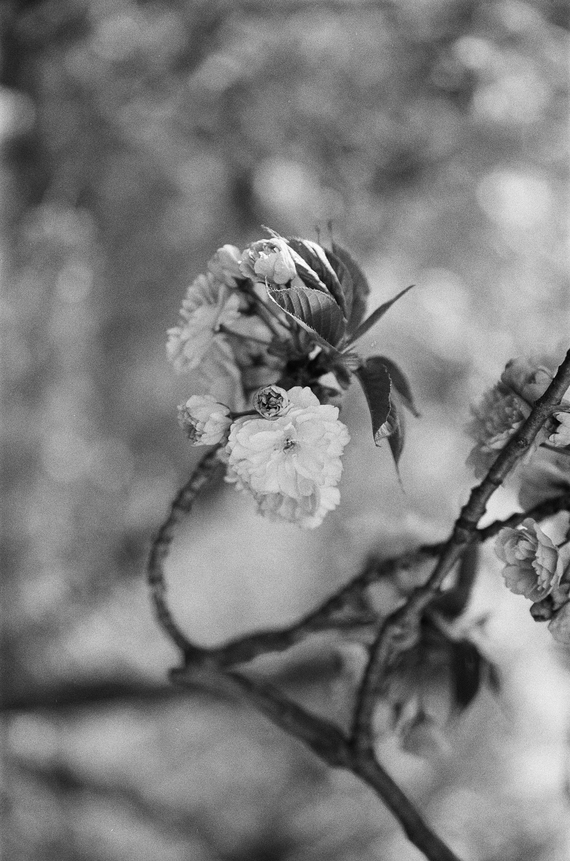
But aren’t photos about capturing reality? If that were true, we would all use pinhole cameras, ensuring we capture everything in sharp focus. If photos were about realism, nobody would shoot black and white film.
Shot on Ilford HP5, ƒ/1.4
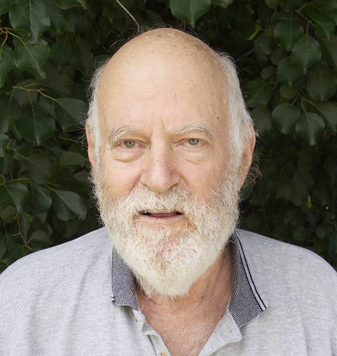
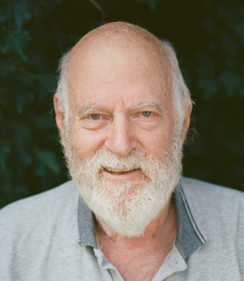
Consider this HDR photo of my dad.
0:00
/0:10
Shot in ProRAW
HDR reveals every wrinkle and pore on his face, and the bright whites in his beard draw too much attention. Just as you might use shallow focus to draw attention on your subject, this is one situation where less dynamic range feels better than hyper-realism. Consider the Process Zero version, with HDR disabled.
Process Zero, without Tone Mapping
While we have plenty of work before Process Zero achieves all of our ambitions, we think dynamic range is a huge factor in recapturing the beauty of analog photography in the digital age.
Shot on film.
We think tone mapping is an invaluable tool that dates back hundreds of years. We think HDR displays have amazing potential to create images we’ve never seen before. We see a future where SDR and HDR live side by side. We want to give you that choice — whether it is tone-mapping, HDR, or any combination thereof. It’s the artists’ choice — and that artist doesn’t have to be an algorithm.